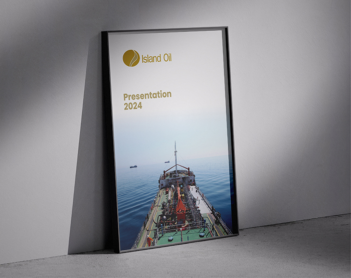


The booklet was created to convey trust, stability, and industry expertise—core values of the brand—through a carefully considered visual and editorial approach.
A gold, deep brown, and white colour palette was used to reflect strength, reliability, and sophistication, while the layout, typography, and design elements ensured clarity and impact. The result is a polished and professional publication that enhances Island Oil’s corporate image and communicates its message with confidence and consistency.


